
After having explored my four different practitioners, I am now ready to move onto choosing one of them to influence my own cover design process. Across the board, each designer has been tasked with reviving stories of older eras by creating covers that reflect the classic genre but in a contemporary manner. The predominant elements used by all four to achieve their briefs would be colour, font and image.
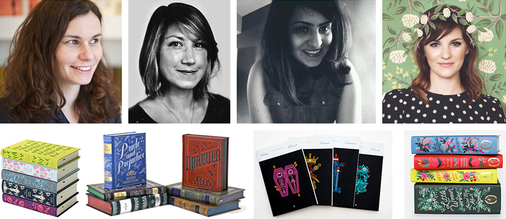
Each designer has embraced the use of colour that we have in today’s printing technologies, selecting from ranges of bright/warm yellows, pinks and purples, to deep rich reds, greens and blues. Each designer has carefully selected their palette on each cover to reflect the mood or era or a specific set of content in each story.
The fonts are mostly serif and decorative, except for Manuja Waldia’s book cover’s that use a sans serif font to completely make a modern statement and instead allow for the image to be the focal point. The use of serif, decorative fonts draws upon the classical genre of fairy tales and creates that enchanting, quaint feeling to the stories. It makes the reader feel that they have picked up something old and special/magical.
This is also created with the imagery (once again excluding the works of Manuja Waldia) as it is apparent that the heavy floral, handcrafted patterning of the Arts and Crafts Movement and curvilinear line work, analogous colours and elegant patterning of the Art Nouveau periods play through in each designer’s illustration styles.
Waldia has instead made her work very geometric, yet the use of curvilinear line throughout the work creates a vivid movement that could also be reflecting of an Art Nouveau style.
These three elements are what I will need to consider when designing my own covers. Also, I think that working within a grid is important to consider as well. I would like to play around with a few different grid layouts in my concept stage.
